Managing your cards and transactions from your phone shouldn't mean jumping between tabs to find what you need. Until now, the Reap Mobile App split card information and transaction history across two separate screens — making it harder to get a quick answer to simple questions like "what did I spend on this card?" or "why was this transaction declined?"
That changes today. We've consolidated the Reap Mobile App into a single, unified home screen where you can switch between cards instantly, see transaction statuses at a glance, and view foreign currency amounts without tapping into each transaction. The result: fewer taps, faster answers, and a mobile experience that matches the clarity of the Reap Direct dashboard.
What Changed
Unified Home Screen
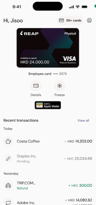
When you open the app, everything you need is on one screen: your active card with available balance, quick actions, and recent transactions for the selected card.
The old two-tab layout (Home and My Cards) has been merged into a single view. No functionality was removed — everything from both tabs is now accessible from one place.
Card Switching
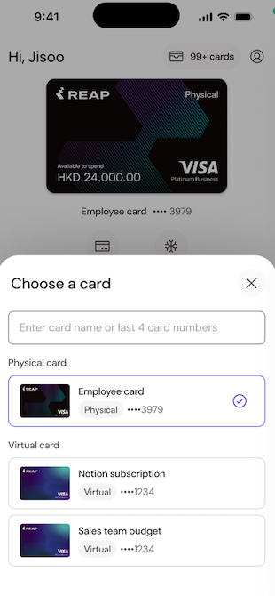
Tap the card icon in the top-right corner to open a searchable list of all your cards — both physical and virtual. Search by card name or last 4 digits to find the one you need. When you select a card, the home screen updates immediately: the card display, available balance, and transaction list all reflect the selected card.
Transaction Status and Currency Display
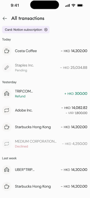
Transaction colors now communicate what matters most: status. Pending transactions display a "Pending" label, declined transactions appear in red, and refunds show in green with a positive amount. This matches the status system used on the Reap Direct web dashboard.
For foreign currency transactions, both amounts are now visible directly in the transaction list. Your card currency amount appears in standard font, with the original foreign currency amount shown in smaller text below — so you can see exactly what was charged without tapping into each transaction.
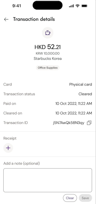
Transaction Details
Tapping a transaction opens a simplified detail screen. We removed non-funTap the card icon in the top-right corner to open a searchable list of all your cards — both physical and virtual. Search by card name or last 4 digits to find the one you need. When you select a card, the home screen updates immediately: the card display, available balance, and transaction list all reflect the selected card.ctional fields like the "Transaction review" label that served no purpose for most users. The detail screen now shows exactly what you need: amount in your card's currency with the foreign currency below, merchant name, category badge, card name, transaction status, payment and cleared dates, transaction ID with a copy button, receipt upload, and an optional notes field.
Card Quick Actions
"Details" and "Freeze" are now available as icons directly below your card on the home screen. Previously, freezing a card or viewing card details required navigating to a separate screen — now it's one tap from wherever you are.
Performance
The app is noticeably faster across the board, with improved loading times for cards and transactions.


