.png)
At Reap, we build for teams that move fast. Our products evolve constantly to match the pace, ambition, and working style of the businesses that rely on them. That means we don't wait for things to feel outdated before we make them better.
This time, we went further than an update. We rebuilt Reap Direct from the ground up – a complete overhaul of the entire dashboard, designed around how you actually work every day, built to make you efficient. The result: a significantly faster, more intuitive experience that lets you get through treasury, card management, payments, and team operations in less time and with less friction – so you can spend more of your day building, not navigating.
Here's what's new and why it matters.
What's New at a Glance
Performance & Stability
This is the improvement you'll feel the moment you log in.
Reap Direct now loads 10x faster across the board – pages, cards, transactions, everything. What used to take seconds now happens instantly. The entire dashboard feels snappier and more responsive.
Beyond speed, we've fixed over 100 bugs across the application for a more reliable, stable experience. Fewer glitches, fewer edge cases, fewer moments where something doesn't work the way you'd expect.
Treasury
Treasury now gives you full visibility into your balances and fund movements the moment you land on the page – no extra clicks to get to the detail that matters.
Fund movement activity is visible by default. Every transaction – date, type, description, amount, rate, asset, and hash – is displayed in a clean table view. You can filter by any field and export directly from the page, making reconciliation and reporting significantly faster.
Asset-level breakdowns show you exactly how your USDC, USDT, and other assets are distributed within each wallet, so you always know where your funds sit at a glance.
Centralised actions for moving and adding funds sit at the top of the page and within each balance, so you can act from wherever you are. Both flows now open as full page experiences, giving you more room to work and fewer clicks to complete.
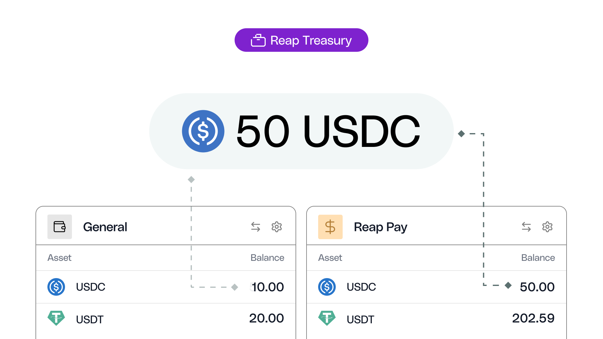
Moving Funds
This is one of the biggest improvements you'll notice right away.
Transferring funds now happens on a single, streamlined page. You pick your accounts from inline dropdowns, enter the amount in a larger and more prominent input field with asset selection built in, and confirm – all without leaving the screen.
The result: materially fewer clicks and a noticeably faster experience every time you move funds between your Card, Pay, and Optimize accounts.
Cards
Card management is now faster and more powerful.
Card creation is now a single step. Choose between physical and virtual cards in one unified flow, with a real-time summary of card attributes and the card design displayed on the right as you configure it. One entry point, one step, done.
A new table view gives you better information density with granular filters – search by status, card type, receipts, and last four digits to find any card instantly. Quick actions in the card drawer let you freeze, unfreeze, or terminate a card without navigating away. You can also change your ATM PIN directly from the same drawer.
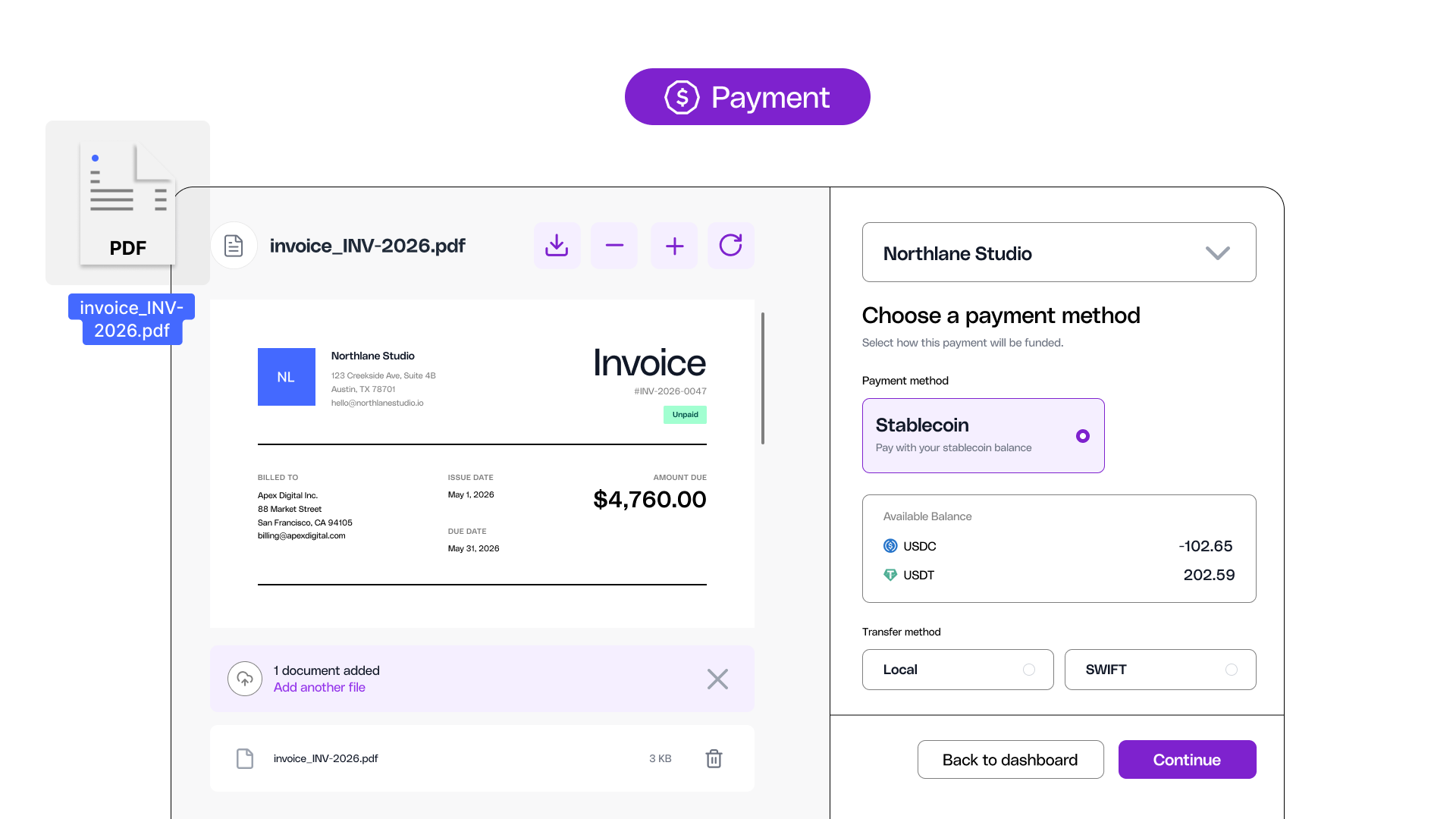
Payments
Payments are now smoother and easier from start to finish.
A built-in document viewer sits alongside the payment flow, so you can see your invoice on one side while filling in the payment details on the other – and download documents when you need them for audit purposes.
The payment flow has fewer steps between opening and sending. Recipient creation now lives in a quick drawer for faster setup.
The payment drawer is better structured, giving you quick access to preview and download attached documents, see approval status, and view the recipient's bank details – all without leaving the page.
Quick actions on the payments table let you delete or send a payment directly from the list. You can also see at a glance how many payments sit under each status from the page tabs – no need to click through to count.
Balances & Statements
The old repayments page has been replaced with a new consolidated view.
Balances, statements, and repayment information are merged into one page with a cleaner breakdown of your key numbers. You can see what you owe and act on it from the same screen – no jumping between pages.
Quick access to the balance locked in top-up cards with a direct link to filter, and adding funds is now labelled plainly as "Add Funds." You can also jump into the repayment flow directly from this page.
Team Management & Approvals
Everything to do with your team now lives in one place.
The Team page has two tabs: Members and Group Settings. Groups are managed right alongside your team members, which makes day-to-day admin faster. Adding a new team member opens a clean side drawer where you can set permissions and assign groups in one go.
Approval workflows are quicker to set up. Creating a new approval policy follows a simplified flow with fewer steps, and both the approval request and policy pages have a cleaner, more intuitive design.
Look & Feel
The entire dashboard has a revamped, modern design – clean, focused, and easy on the eyes.
Dark mode is here. Switch between light and dark to match your preference and reduce eye strain during long sessions. It's a look that feels as fast as the product now is.

Everything Else
A few more improvements that make daily use smoother:
- Settings are now accessible directly from the sidebar. Fields are directly editable with Cancel and Save controls – no more separate Edit button. Tabs are reorganized for clarity, and notification toggles let you control what you hear about by category (Cards, Payments, account settings, team activity).
- Request a Feature is now built into the dashboard – submit feedback directly without leaving the app, with file upload support for screenshots and documents.
- Streamlined account management with quick actions throughout drawers and pages.
- Tooltips now always display action names when hovering over icons – no more guessing what a button does.
- Forms now protect your work: if you accidentally close a form, you won't lose what you've entered.
- View all top-up card options directly from the Balance page.
- A new column on the Transactions page shows which entries have a receipt attached.
- Improved pagination for smoother navigation across large lists.
- Contextual tags throughout drawers and pages to help you orient faster.
What's Next
This rebuild lays the foundation for even faster feature development going forward. We've built a frontend that's more robust, more scalable, and ready for what's coming next.
Log in and see the new Reap Direct for yourself. If you have feedback, use the new Request a Feature form – we're listening.


